
# The Psychology of Negative Space: How to Design “Silent Spaces” to Create Smart Visual Messages?
In the world of graphic design, many believe that creativity lies only in what you draw. However, the truth is that ” what you leave empty ” is just as important as what you fill. Negative Space is not just neglected white space; it is a strategic tool that gives a design its balance and directs the viewer’s eye toward the core message.
—
## 1. The Philosophy of Space: Why “Less is More”?
A professional designer understands that the human eye needs visual “breathing room.” When elements are crowded, what is known as “visual noise” occurs, leading to viewer distraction and the failure of the marketing message.
Function: Reducing the cognitive load on the viewer.
Result: A design that is easy on the eye, highly readable, and carries a premium, modern feel.
—
## 2. Gestalt Principles: How Does Space Trick Our Brains?
The success of negative space relies on principles of cognitive psychology, most notably:
Law of Closure: The human mind tends to complete unfinished shapes. When you leave a deliberate gap, the viewer’s brain fills it in, creating a mental engagement that makes the design memorable.
Figure-Ground Relationship: This is the ability to separate the main element from its background. A smart designer makes the background (the space) form another shape that serves the deeper meaning of the brand.
—
## 3. Anatomy of Creativity: Hidden Messages in Global Logos
The best way to prove the power of negative space is to look at logos we see every day with a keen eye:
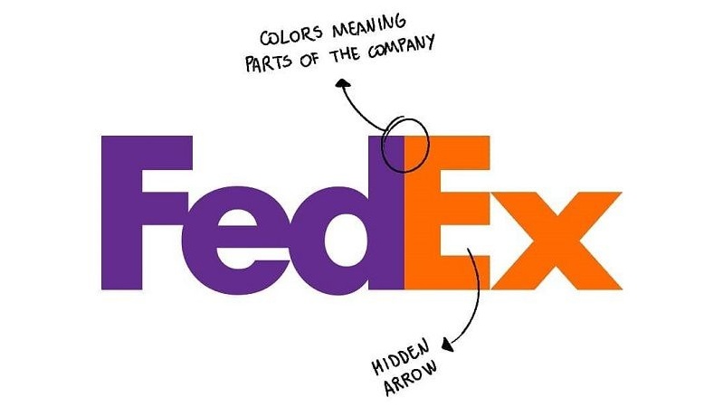
FedEx Logo: Have you noticed the arrow between the letters ‘E’ and ‘x’? This space conveys speed and precision without writing a single word.
WWF Logo (The Panda): The white spaces are what define the panda’s features; without the clever use of negative space, the design would just be random black spots.
—
## 4. Practical Tips for Using Negative Space in Your Next Project
To make your designs look more professional and impactful, follow these steps:
1. Trust Simplicity: Don’t fear wide open spaces; they add “Premium” value and luxury to the product.
2. Visual Hierarchy: Use space to isolate important elements (like Call to Action buttons).
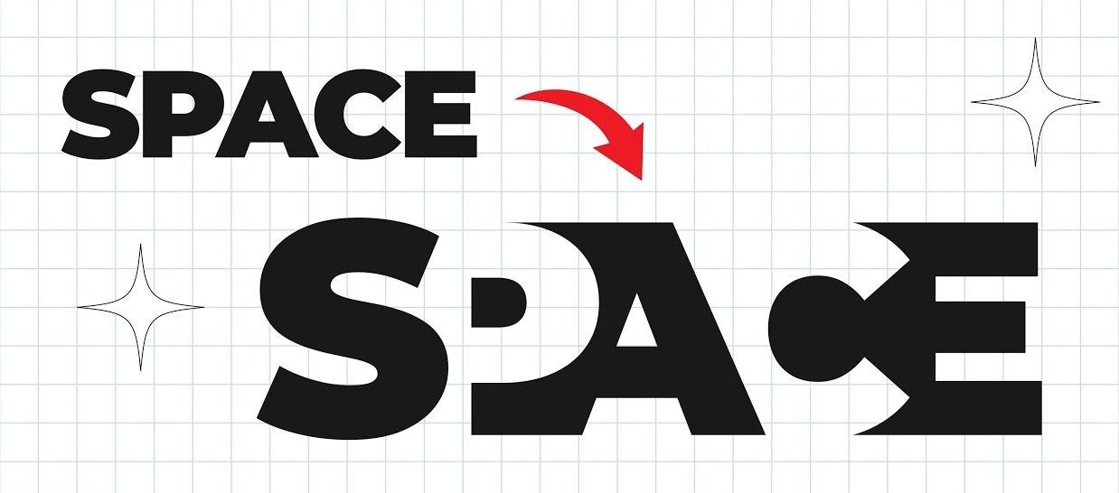
3. Smart Overlap: Try to merge two meanings into one element (e.g., merging a product shape with a symbol representing the company’s values).
—
### Conclusion: Space is the Silent Voice of Design
Mastering negative space is what differentiates “graphic arrangement” from “strategic design.” It is the art that proves visual silence can be more eloquent than a thousand words, and it is your key to building unforgettable visual identities.
Simple gallery